

Plotly Express
“Less code, Efficient & time saver” Plotly Express (python lib)do more interactive Data Visualization.
![]() Wow! finally I found this
Wow! finally I found this plotly_express a new interactive python lib from plotly, so far this is one of the best Data visualization lib I have ever used in python. I liked the way it makes Dark template, interactive labels.
import plotly_express as px
import matplotlib.pyplot as plt
%matplotlib inline
gapminder = px.data.gapminder()
#gapminder2007 = gapminder.query("year == 2007")
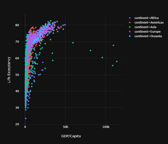
pd = px.scatter(gapminder, x="gdpPercap", y="lifeExp",template='plotly_dark',color='continent',labels = dict(lifeExp='Life Exceptancy',gdpPercap = 'GDP/Capita'))
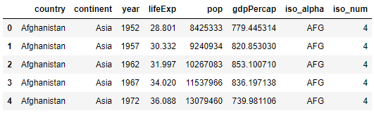
gapminder.head()
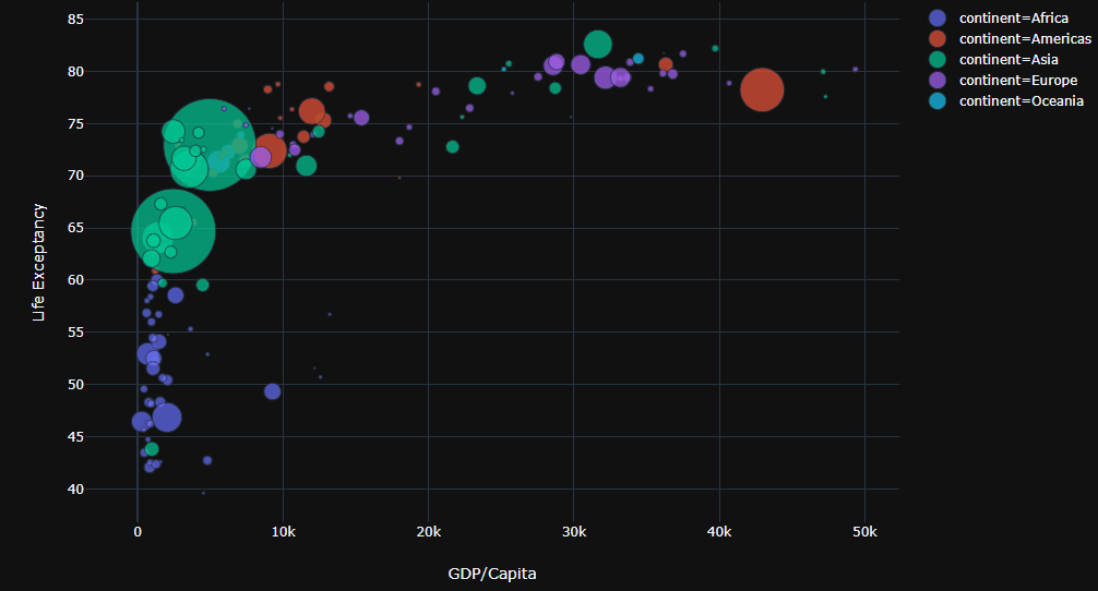
gap2007 = gapminder.query('year == 2007')
px.scatter(gap2007, x="gdpPercap", y="lifeExp",template='plotly_dark',color='continent',hover_name='country',size='pop',size_max=60,labels = dict(lifeExp='Life Exceptancy',gdpPercap = 'GDP/Capita'))
In a single line by just writing
hover_name,sizeandlabelswe can interactively show the visualization on python.
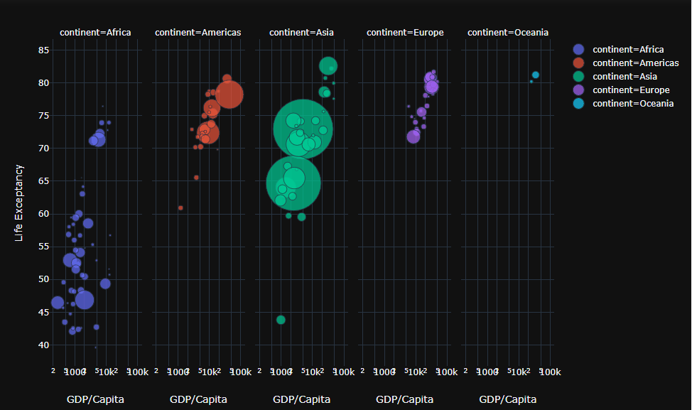
We can facet the plot to pick apart the continents just by adding
facet_col = "continent"it may be convenient to make x-axis as logarithmic which looks visually clear.
px.scatter(gap2007, x="gdpPercap", y="lifeExp",template='plotly_dark',facet_col = "continent", log_x= True,color='continent',hover_name='country',size='pop',size_max=60,labels = dict(lifeExp='Life Exceptancy',gdpPercap = 'GDP/Capita'))
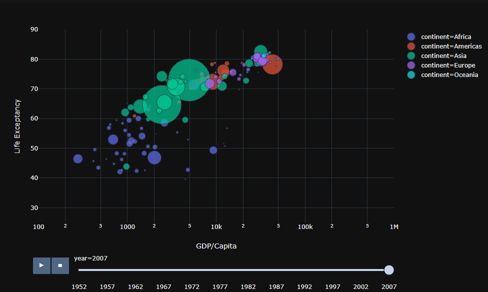
Now lets make some animation in plotly_express, how handy it is! just by adding the animation_frame= "year" and animation_group ="country". Why don’t we put some manual bounds such as range_x = [100,1000000] and range_y = [25,90]. ![]()
px.scatter(gapminder, x="gdpPercap", y="lifeExp",template='plotly_dark', log_x= True,color='continent',animation_frame= "year",animation_group ="country",hover_name='country', range_x = [100,1000000], range_y = [25,90] ,size='pop',size_max=60,labels = dict(lifeExp='Life Exceptancy',gdpPercap = 'GDP/Capita'))
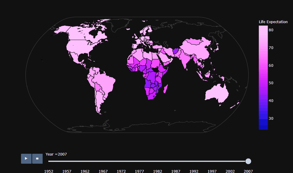
We can also make animated world map by simple px.choropleth and here location = iso_alpha since there was no data for Russia in gapmider datasets hence it was remain faded.
px.choropleth(gapminder,locations="iso_alpha",projection="natural earth",template='plotly_dark', color='lifeExp',labels =dict(lifeExp='Life Expectation ',iso_alpha ="Location " , year = 'Year '),animation_frame= "year",animation_group ="country",hover_name='country')
Leave a Comment