
Data Visualization Projects: Titanic Dataset Analysis, Finding Survival Rate
Titanic tragedy: finding and analyzing the survivor rate.
Data set were available at kaggel, find this projects on my kaggle kernel.
Access the Dataset here.
It’s been more then 100 years since Titanic disaster happened. When the “unsinkable” ship, the largest, most luxurious ocean liner of its time, crashed into an iceberg on its maiden voyage in 1912, it took more than 1,500 of its 2,200 passengers to the bottom.
What was the main reason of this tragedy!
Who were the passengers?
Which city were they Embarked from?
What was the economical condition of the city of that time!
Which passengers class was most affected on this disaster?
Were they child, male or female?
Who survived most was it single passenger or with family. Who were prioritize!
Cool, lets answer all this question one by one form the dataset set I got. I will be using python library numpy and pandas to clean and manipulate the data. matplotlib and seaborn to visualize and analyze the data.
Ok lets dig deeper into 🚢 the blue.
import pandas as pd
from pandas import Series, DataFrame
import numpy as np
import matplotlib.pyplot as plt
import seaborn as sns
%matplotlib inline
titanic_df = pd.read_csv('train.csv')
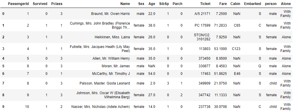
titanic_df.head()
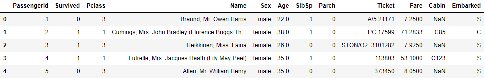
This is our main table, its pretty much clear from the dataset that we have number of passengers information.
Here PassengerId is a unique number. Ok great! so we have their Name their Sex and Age. Whether they bboard with Siblings/Spouses showed in SibSP; Parch - Number of Parents/Children Aboard.
oh! Here I thought it would be meaningful to mention:
| Embarked | City |
|---|---|
| C = | Cherbourg |
| Q = | Queenstown |
| S = | Southampton |
| Pclass | Passengers Class |
|---|---|
| 1st = | Upper |
| 2nd = | Middle |
| 3rd = | Lower |
titanic_df.info()
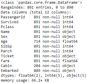
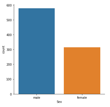
From top info; We have 891 entries, but due to some non number values (NaN) in Age:714, Cabin:204, Embarked:889 it has less number of rows. I must need to clean the data if we want go further into analysis with this datasets. You will find it in the later session of this post. Lets have a quick look of sex ratio in the Titanic at the time of voyage.
sns.catplot("Sex",kind="count",data=titanic_df)
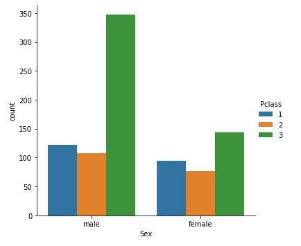
We saw Titanic had three different passengers class, are they male or female who bought most/less of the Upper, Lower or Middle class tickets. WE have an answer:
sns.catplot("Sex",kind="count",hue="Pclass",data=titanic_df)
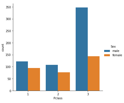
From this dataset we don’t have separate column to show male female and Children, so that we can identify their ratio. May be I will define the Age below 16 as children.
def male_female_child(passenger):
        age,sex = passenger

        if age < 16:
            return 'child'
        else:
            return sex
- I am adding a new colum called child titanic_df [‘person’] into my titanic dataset to view the child ratio.
titanic_df['person'] = titanic_df[['Age','Sex']].apply(male_female_child,axis=1)
What our values looks now for the first 10 rows!
titanic_df[0:10]
Now we have three categorized passengers, lets plot it into a bar chart using catplot
sns.catplot('Pclass', kind ='count', hue ='person',data=titanic_df)
Leave a Comment